Designing against the grain of your category
Most categories share a visual language. Some of that is signal — a reassurance that you are in the right shop. Most of it is laziness. Knowing the difference is half the job.
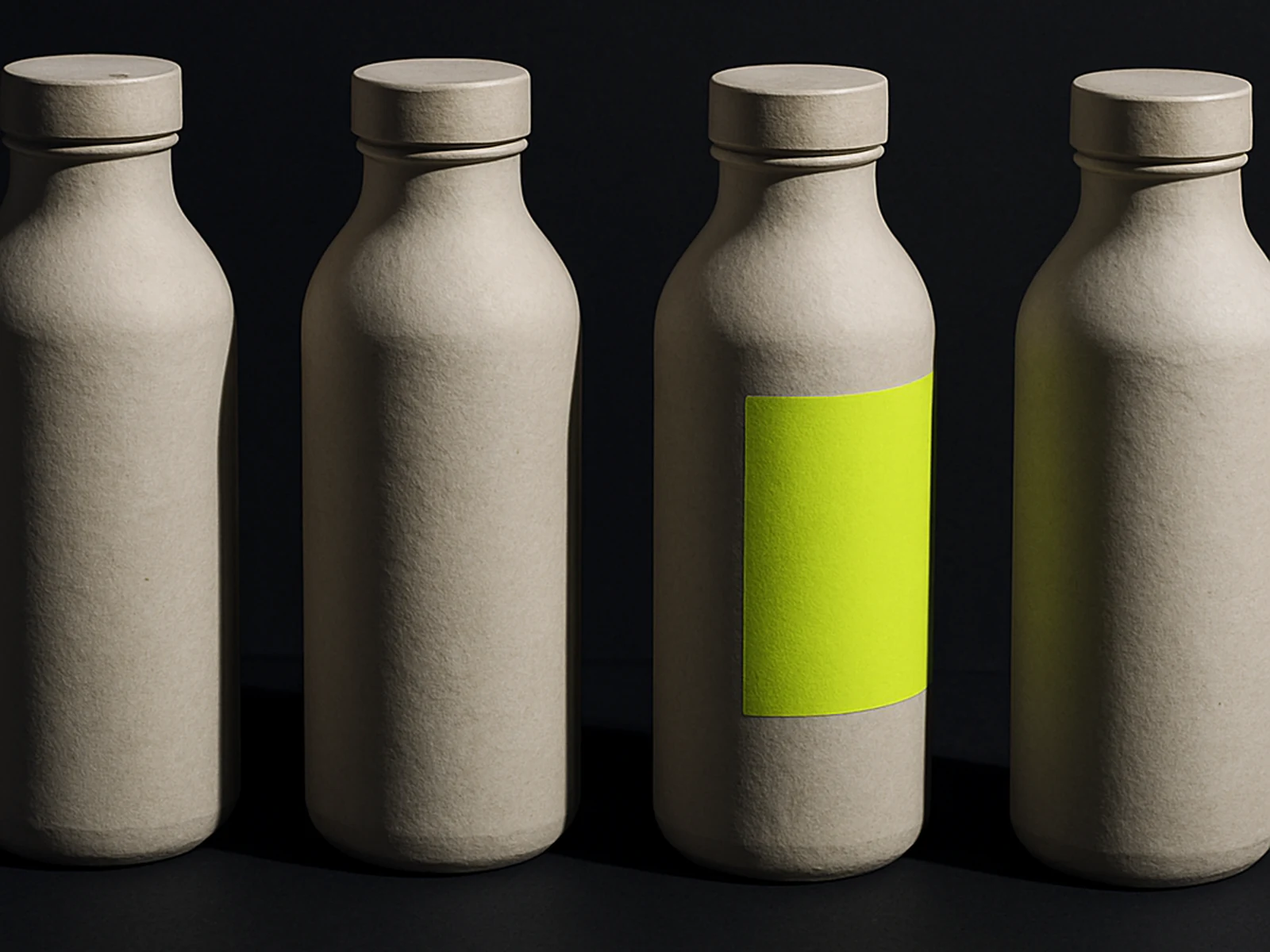
Walk into a wine shop and notice how many bottles share the same posture: a cursive on a label, a coat-of-arms, a vineyard at golden hour. Open a fintech app and notice how many of them feel the same: a soft gradient hero, a friendly mascot, a chart that probably is not your data.
Convention does some real work. It tells your customer they are in the right place. A bottle that looks nothing like wine is harder to sell, even if the wine is excellent. A banking app that looks like a synth-pop poster is going to lose to one that looks reassuring, even if the maths is identical. So when we sit down with a client and they say "we want to look completely different from everyone in the category", we ask them which conventions they actually want to break.
Some are load-bearing. They tell people what kind of thing this is. Break them too cleanly and you confuse the people you want to convert. Others are decorative. They have been copied so many times nobody remembers why they exist. Those are free to break. The work is to figure out which is which.
We do this with a category audit at the start of identity engagements. Pin every direct competitor on a shared board. Note the conventions they share. Sort them into the load-bearing and the decorative. The brief that comes out the other side is more honest than "stand out": it says, in writing, which signals we are keeping and which we are deliberately abandoning. The client signs that brief before any visual work starts. Nobody is surprised at the end.
Doing this properly is also how you avoid the most common failure mode of bold work — bold for the sake of bold. The brief is a contract you can read against the design. If a design move is not breaking a convention you wrote down, it is decoration. Decoration is fine, but it is not the point.